Is your insurance agency website the equivalent of a pair of stone washed Bugle Boys?
If you’ve been following the Advisor Evolved blog, you’ve probably heard me say many times that there are many different variables that go into a successful digital presence.
Like insurance, many of those variables are constantly changing, and it can be difficult to keep up with all of the different trends and strategies in the online marketing space.
In the new world of Google, there are over 200 different ranking variables that go into the ranking equation. Digital marketing has more moving parts than ever before. With that said, there is one common denominator that all successful online brands share:
Good design.
You may have heard the saying “Good design is marketing” and that has never been more true than now.
Unfortunately, a lot of people are missing the boat on some very important concepts when it comes to the design of their website(s).
At Advisor Evolved, we get to see a lot of different agency websites, many of which are severely outdated, both in terms of functionality and visual curb appeal. At the end of the day unless you are a designer and/or have studied conversion data, you likely have no idea how a website should be designed, and that’s okay because that’s not your job.
If this is the case for you, it’s important that you place your trust in the hands of an experienced professional who understands the right way to build a website, and then get out of the way and let them do their job.
That might seem a bit harsh, but you can actually do more harm than good if you try to take something on that you’re simply not qualified to do.
Kind of like the insured who says, “I was talking to my neighbors step-sisters brother-in-law who is a firefighter and he said I have too much coverage and thats why my price went up”. Who should your customer trust, them, or you?
Bottom line, the design, functionality, and visual flow of your site is extremely important. If you don’t know what works and what doesn’t, and what doesn’t look good anymore, your online brand will quickly lose its purpose and could be turning people away as fast as they come.
Here’s how to fix that though:
Over the years there have been many different trends in design, some good and some bad. Here are some things to avoid when it comes to your insurance agency website.
Stuff that is no longer cool for websites

Sliders and Carousels: the tight-rolled jeans of the internet

There’s no other way to say it — sliders, scrollers, image carousels and anything else that blinks, flashes, or moves are just not cool anymore in web design.
They scream “out-dated”. It’s true. What’s more, anything that scrolls or moves is reliant on Javascript which is a code language that is needed to create interactive effects on a webpage.
The problem with sliders, scrollers and carousels is not only do they negatively impact conversions, but because of their reliance on Javascript, they can weigh your page down big time, which will make your website load slower and slower. More on that in a minute, but bottom line, get anything that slides off your site.
It’s not cool anymore and it hurts the speed of your site and conversion opportunities.
So yeah, it’s pretty much the worst thing ever.
Rotating Insurance Company Logos

Many people believe that showing what insurance carriers you represent on your website is a good way to build trust with a visitor. The truth is, the average insurance consumer isn’t familiar with many of the carriers independent agents represent.
When you present something to someone that they’re unfamiliar with, their immediate reaction is to question it, not trust it.
Sure, the average consumer knows who Allstate, StateFarm, Geico and Progressive are, but do they know who Auto Owners, Grange, Encompass or Hanover is?
No! They don’t! And don’t foolishly assume that because you have heard of them, they will.
How many times have you had a client say “Who is that? I’ve never heard of them. I’m staying with State Farm for now.”
That type of reaction doesn’t often end in someone taking a positive action.
In reality, showing carrier logos on your site adds no value. If anything it could lower your credibility if the consumer isn’t familiar with many of the carriers you represent. Also, again anything that slides can slow down your site.
Get those carrier logos off your site, and replace them with something that adds value like testimonials from your insureds.
Cheesy Stock Images

There are stock images, and then there are cheesy stock images. Just don’t do it folks. Using stock images on your site can sometimes be a necessary evil, and if you need to do it, there are a couple things you should stay away from.
Rule number one: Don’t use images with fake business people in them.
Rule number two: Don’t use images with fake business people in them strategically arranged in incredibly unrealistic scenes and poses (like the picture above).
Everyone knows that those aren’t your real employees. That’s not what your office looks like either. Just don’t do it folks. You’re a professional organization. Spend some money and hire a professional photographer who can take real life photos of you, your staff, and your office.
Good photography will help humanize your brand. Conversely, cheesy stock images just make you look bad.
However, if you must use stock images with people in them though, make sure the poses are natural and not as staged. A few stock images sites I really like are Pexels and Picjumbo.
The Oversized Logo: your laser background school picture

“Can you make my logo bigger?” If you happen to be a designer, you’ve heard this a million times.
I understand that some people are prideful about their brand and logo, but there is no reason your logo has to eat up 25% of the top half of your website, especially when it’s not a great logo. Most aren’t!
Unfortunately that’s the case for a lot of small business owners because a lot of people look for the cheap way out when it comes to graphic and web design. Not trying to be a Debbie Downer here, but it’s true.
Look, we get it — you’re Jones Insurance. A smaller logo would have told us the same thing and not eaten up valuable real estate on your site.
Rule number one with logos: they don’t need to be any wider than 400px and that’s even a stretch. A logo that’s too big takes up way too much space. It’s just unnecessary. You’re not selling anyone on your brand or logo right now.
Bonus Points: you should always have an alternate version of your logo. So if your logo is more of a boxy or square shape, you should also have a version that is more horizontal so it can fit better on your website.
(Google Ranking Killer) Your Mobile website looks like a scene from Oregon Trail

In today’s episode of “When mobile websites attack”, we’ll discuss the proper way to “do” mobile.
Did you know that a non-responsive website is a big no-no with Google? If your website is not mobile responsive, it’s defeating the entire purpose of having a website.
Google’s algorithms actually favor mobile responsive sites now.
With so much traffic coming from mobile devices, the appearance and functionality of your website on mobile is more important now than ever before. In fact, it could quite literally make or break the success of your entire website.
Mobile now represents 65% of all traffic on the internet, yet a lot of agency websites are only built for desktop. This is a major problem for a variety of reasons.
What’s more, 38% of visitors will abandon a mobile website in under 1 second if the content and design is unattractive.
Statistics show that a mobile responsive (not mobile friendly) website increases several important SEO metrics, as well as engagement and lead opportunities.
Benefits of a Mobile Responsive site:
- Increased Traffic
- Increased Business Leads
- Increased Sales and Revenue
- Ideal, Quality User Experience
- Improved User Journey
- Brand Consistency Across Multi-platforms
- SEO Compatibility
- Higher Rank in Search Results (SERP)
- Cost Efficiency
- Ease of Site Management
- On-the-go Access
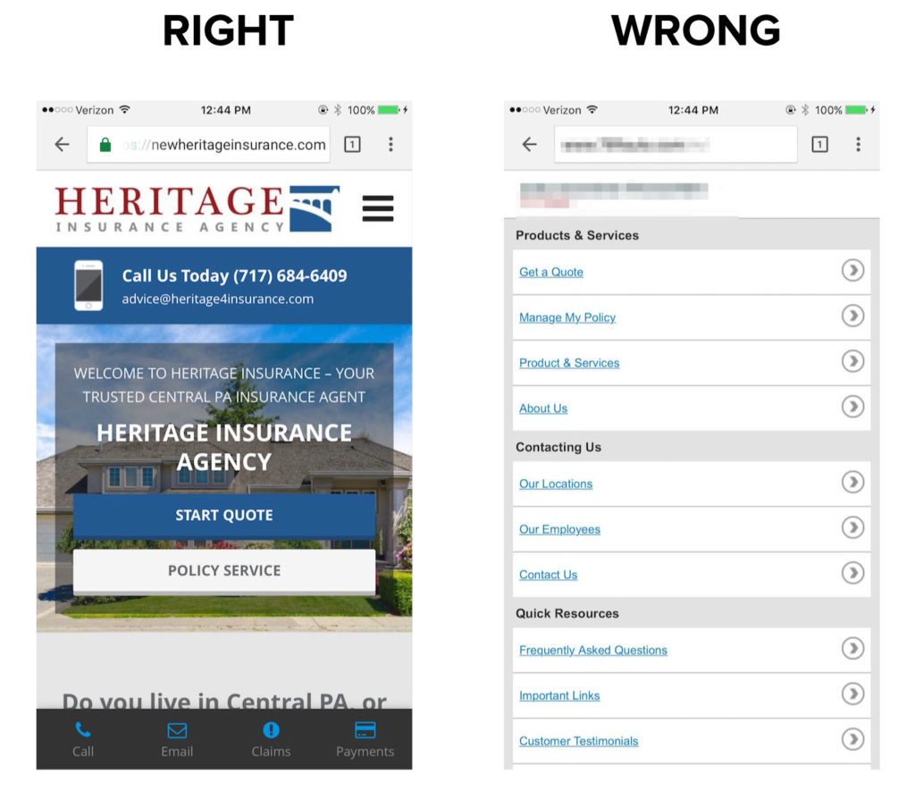
Example of how and how not to do mobile:

The site on the left is an Advisor Evolved site. The one on the right is from a popular competitor of ours.
Some may argue that the version on the right is actually easier to navigate, however everything you can do on the right you can do on the left and it doesn’t look like 1980.
More importantly, now that Google is establishing very strict guidelines on prioritizing mobile SEO ahead of desktop, if your mobile website is actually a different version of your desktop site, like the picture above on the right, it’s going to eventually tank your websites SEO, and ROI — period.
Bottom line, if your site is not mobile responsive, it’s defeating the purpose of having a website, because it’s tanking your SEO, and you’re throwing money down the drain.
Harsh, but so true.
Design elements & and other stuff that negatively impact conversions

Social Media Icons Above the “Fold”
The top half of your agency website (fold area) is the most valuable piece of real estate on your website. Don’t waste this valuable space with things that can take away from what you want the visitor to do.
You have a very short period of time (average 3 seconds) to get someones attention. You have an even harder time keeping them on the page so they can actually take an action.
![]() What would you rather a visitor click on, your Facebook icon, or your Quotes button? Do yourself and favor and get your social media icons out of the header of your site and put them in the footer.
What would you rather a visitor click on, your Facebook icon, or your Quotes button? Do yourself and favor and get your social media icons out of the header of your site and put them in the footer.
In fact, remove any other unnecessary button, tab, text, search box, or link from the top half of your site. The more things people have to click on, the less likely they will click on what you actually want them to click on.
Your main call-to-action is the most important element. Make it easy for people to find it and your conversions will improve. They can look at your Facebook page after they bind coverage.
Your Website is not Responsive (a.k.a. its time to fire people)

It’s almost 2017 folks — not having a mobile responsive site is about as cool as A.C. Slaters hair.
If your website isn’t mobile responsive, it’s time to fire your website company — period.
With the amount of traffic that comes from phones and tablets, having a mobile responsive site is a non-negotiable feature and actually is something Google uses to rank websites. If your site isn’t responsive, other websites are going to step (literally) all over yours, up the rankings ladder and quite literally leave you in the dust.
If your website company is still using a separate “mobile friendly” version of your site, while your desktop site is still not responsive, it’s time to change website providers.
Having a mobile responsive site was a necessity 5 years ago, and even more so now with Google continuously putting more and more priority on the mobile experience.
If your site isn’t responsive, your killing your traffic, conversions and rankings. It’s as simple as that.
If you’re an Advisor Evolved customer, this is something you’ll never need to worry about. All of our builds are meticulously constructed with a mobile-first stylesheet. That basically means we worry about mobile before anything else when we’re building our designs.
No keywords in the H1 (and other title tags)
Another mistake I see on other agency websites is the lack of keywords and on-page optimization, in particular on the home page, which is the most important page on your entire site.
This mistake can literally tank your organic traffic and there are a ton of people who are victims to this.
We all know that you’re a 100% independent, family owned, local agency, but is that the keyword you’re trying to rank your site for? No it’s not.
You’re trying to rank, or should be, for “insurance agency in “insert town here”. Remember people search locally for service providers. I mentioned before how trying to cast too big of a net, will actually hurt your SEO.
Think local, and optimize your site for local.
Your mission statement or tagline should never be the main keyword or the main H1 tag on your site.
If it is, you’re optimizing for a phrase that no one is searching for and it’s hurting your traffic and conversions.
The H1 header tag is the most important title tag on a given web page, so be sure that your H1 is the keyword/key-phrase you’re trying to rank for, or it’s going to be an uphill battle to get any traffic.
You also need to get LSI keywords in the page content as well. An LSI keyword is a variation or alternate version of your main keyword, and they help Google better understand what a given page is about.
Your website has no social proof

There are certain phycological triggers that every website should have if you’re trying to sell something to someone, and social proof is one of them. According to Wikipedia, Social Proof is defined as follows:
informational social influence, is a psychological phenomenon where people assume the actions of others in an attempt to reflect correct behavior for a given situation
Instead of having rotating carrier logos, replace them with real testimonials from your insureds. Over 70% of consumers use customer reviews and testimonials in their purchasing decision. If people have had a positive experience with your agency, everyone needs to know about it.
If you don’t have customer testimonials you should make the time to collect at least 4 of them for your website. If you’re an Advisor Evolved customer, displaying testimonials is a breeze, and our sites also integrate with Rocket Referrals for those of you who want to automate the process of collecting testimonials and reviews.
You’re using cheap hosting that makes your website slow and buggy
There is cheap hosting, and then there is super cheap hosting. If you’re paying anything less than $5/mo for your hosting account, chances are there are thousands of other websites on your server. This is known as “shared hosting” and essentially it’s like a thousand people all sharing the same bath water. I know, gross!
While this type of hosting is inexpensive, the performance and security is absolutely horrible because resources are being divided by hundreds or thousands of websites. Not only does this type of hosting make your website load terribly slow, but it also puts your site at serious risk for malware and hackers.
If one site on the server gets a virus, it could carry over to other sites on the server as well.
Google uses your page load time as a ranking variable, so if your site loads too slow, again, other websites that are faster could be prioritized ahead of yours in search results.
Advisor Evolved sites are hosted on a custom, enterprise grade, SSD (solid state drive) powered cloud infrastructure, so if you’re an Advisor Evolved customer, you don’t have to worry about slow load speeds.
Conclusion
You can tell I’m trying to be funny here, but seriously, if your website has any of the problems mentioned above (and they are problems) it’s time to re-evaluate your insurance agency website.
Whether you sign up with us, or someone else, don’t make these mistakes.
Have you checked out our plans page? It will show you everything you need to know about us! Don’t wait…go now!


